Logo & Landing Page Design
Spence Mechanical reached out asking for a logo and landing page for their heavy duty mechanics mobile services. This Client wanted something that looked modern and suited their own individual style.
Freelance Designer
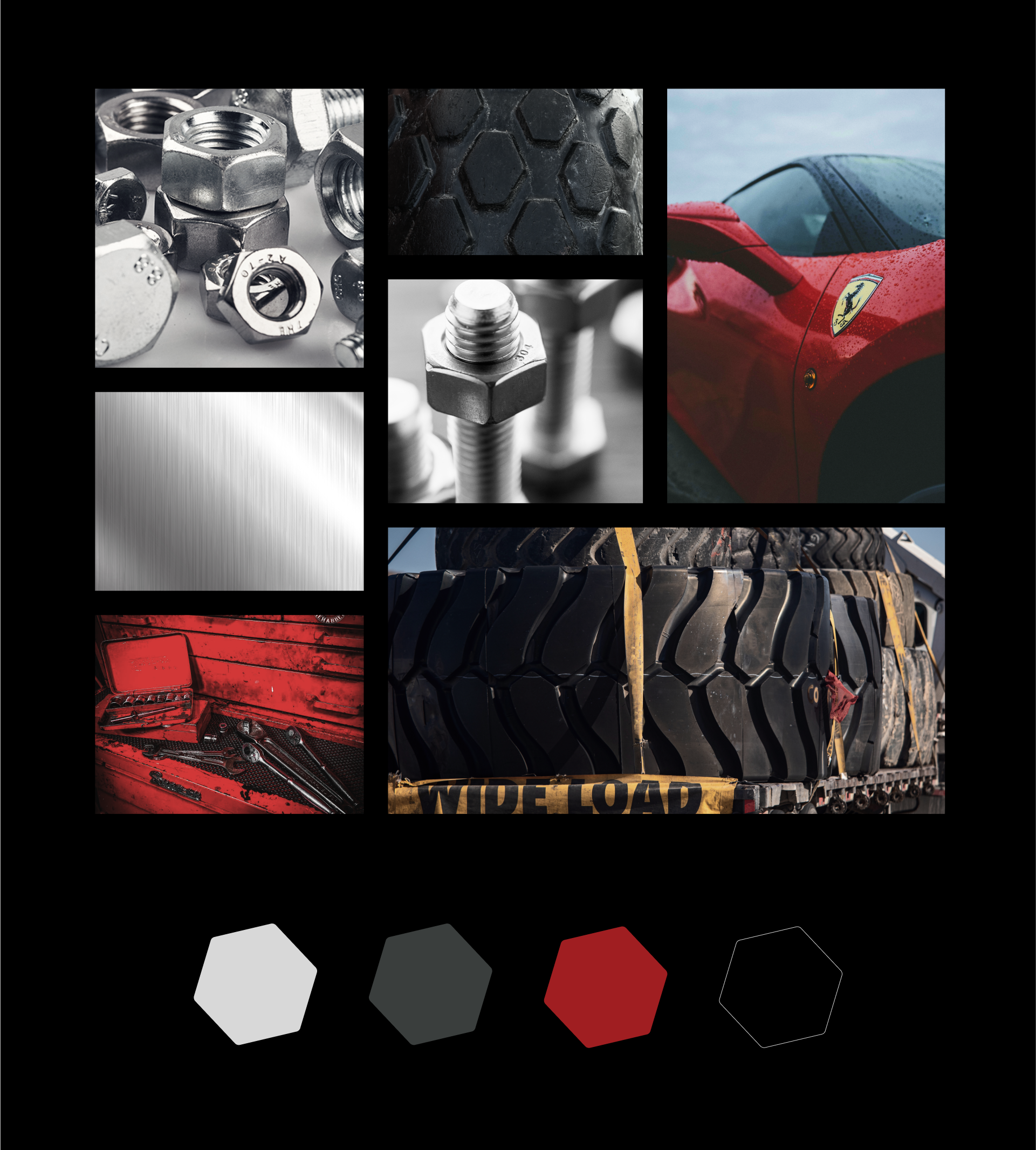
This project was a fun challenge. Instead of relying on the typical crisscrossing screwdrivers and gears often seen in mechanic logos, I took a different approach. The design is inspired by the geometric shapes found in tire treads, bolts, and the box end of a wrench. I styled and paired these elements with a racing-red colour to convey efficiency and precision to represent the companies values.
Logo Design
I designed this logo with a classic appeal, giving it the potential for use on apparel, much like a popular sports brand. The racing-style font is slanted, conveying a sense of mobility and speed. Below is the logo breakdown, showcasing the colour palette and additional variants for diverse usage.
Website Design
Spence Mechanical also needed a simple website that includes a brief bio, a list of services with description drop downs, a photo gallery of past work, and contact form. I designed and created this website using a Squarespace template. As a designer, I enhanced the existing template's limitations by adding custom image and graphic backgrounds, adjusting colours to match the brand, and incorporating simple details like the red strokes under the hero image and above the footer.


