Brand Design
Endurance sports enthusiast Kyle Wills approached me to design a logo and marketing materials for his campaign, Out of the Ordinary. His goal is to raise funds for a monumental challenge: a 4,800 km row across the Atlantic as part of the World's Toughest Row event, set for December 2026.
Kyle’s journey is one of resilience, pushing boundaries, and overcoming mental health struggles through extreme sports. Documenting the entire experience, Kyle will offer an unfiltered look at the psychological and physical challenges he faces, proving that the extraordinary often begins with an ordinary person determined to push past their limits.

Freelance Designer
Understanding that Kyle’s Atlantic Row is just one chapter in his larger journey, I approached this project with a long-term vision. Rather than focusing solely on the event, we discussed the potential to build a brand that could evolve alongside his future adventures and challenges. Given Kyle’s background in film production, I designed a brand identity that reflects not just this single event, but a broader vision for a future production company—one that could document and share his world-class feats for years to come.
Inspiration
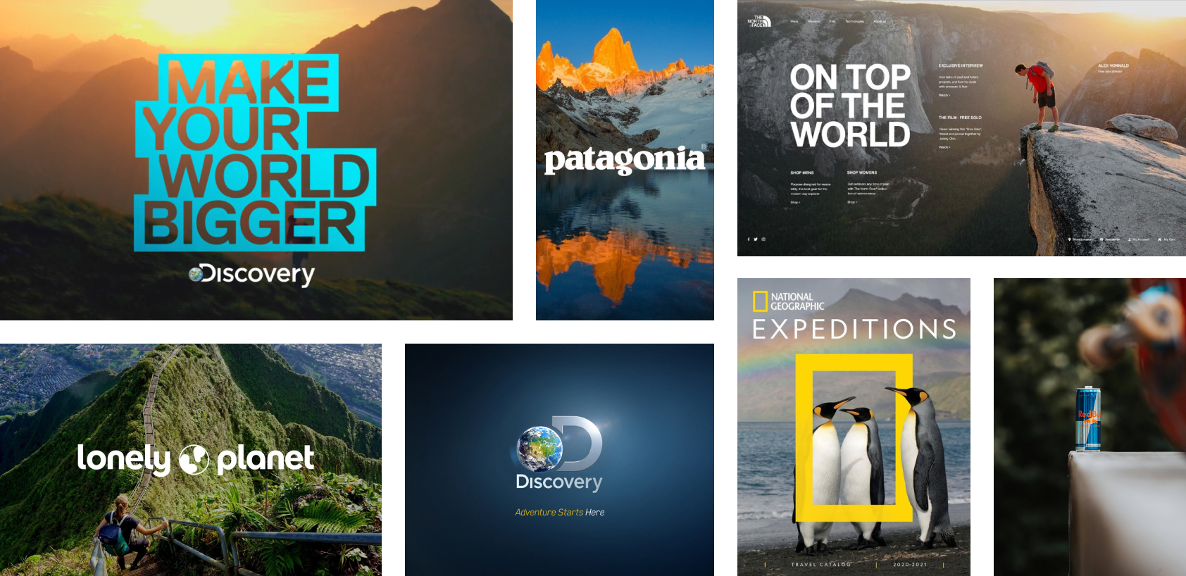
With the potential to evolve into a full-fledged documentary production company, Out Of The Ordinary was inspired by iconic brands such as National Geographic, Discovery, and Red Bull. National Geographic’s rugged, extreme exploration of nature, Discovery’s entertaining adventures, and Red Bull’s boundary-pushing sports content all contributed to the vision. Out Of The Ordinary aims to combine these elements, offering a unique blend of thrilling exploration, captivating storytelling, and cutting-edge action from the perspective of an ordinary man.
Colour Theme
Out Of The Ordinary’s color theme draws inspiration from the vibrant hues found in nature and the world of outdoor adventure, such as mountaineering and skydiving. Many outdoor sports gear, especially in extreme environments, features bold colors like yellow and orange. These colors stand out against the blues and greens of nature, signaling caution or alertness while also representing energy, visibility, and action. This color palette reflects the brand’s connection to adventure, exploration, and the thrill of the outdoors.
Logo Development
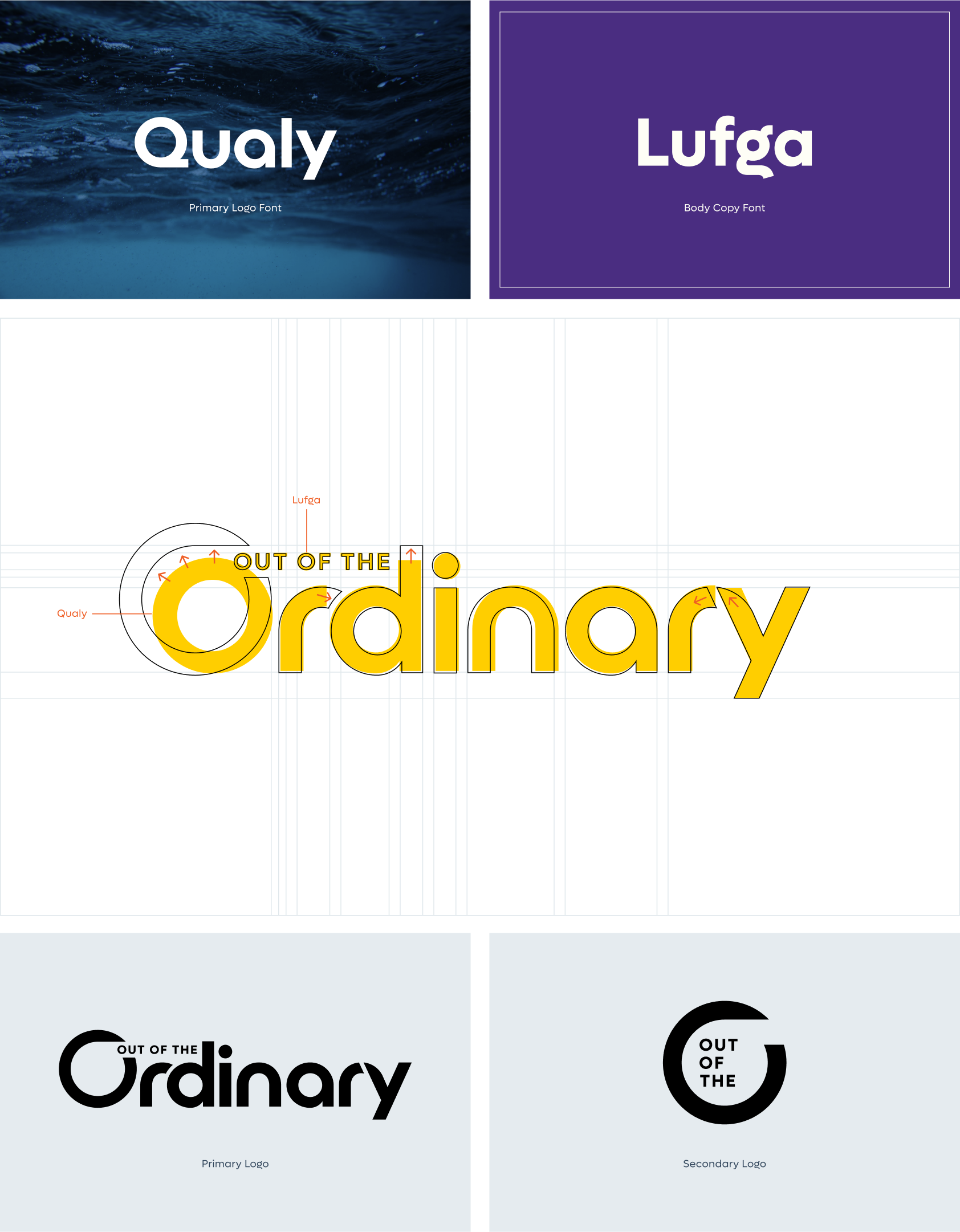
Kyle describes himself as "no pro athlete"—just an ordinary guy driven by a desire to overcome personal challenges through extreme sports. His goal is to inspire others by showing that even someone without elite status—like Alex Honnold from Free Solo—can push their boundaries. With this in mind, I designed the logo to reflect Kyle’s authentic, approachable nature while still capturing the dynamic energy of sports and movement.
When I discovered the font Qualy, its playful yet strong design felt like a natural fit—reminding me of sports brands with an adventurous but accessible vibe. I imagined the logo alongside brands like Patagonia or Yeti, whose identities blend ruggedness with an inviting, down-to-earth feel. As always, I design with long-term potential in mind, ensuring the brand can grow alongside Kyle’s evolving journey.

Marketing Assets
Once the logo and brand theme were established, the next step was to create the key assets Kyle would need to secure funding for his campaign. This included a one-pager, pitch deck, Squaresapce website, and social media announcements—tools designed to give him every advantage as he works to bring his vision to life. Developing these assets allowed me to further define the brand’s identity, ensuring a cohesive look and feel across all platforms.
This project is still ongoing, as the race isn’t until 2026. In the meantime, there will be fundraising and marketing events that continue to build momentum and strengthen the brand. Each of these assets plays a crucial role in shaping the narrative and creating a lasting impact as Kyle’s journey unfolds.
Brand Potential
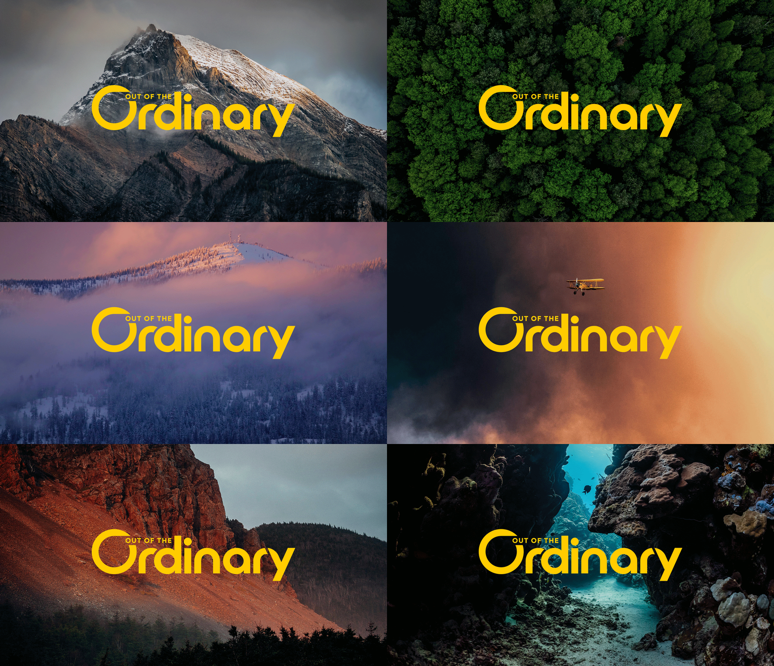
While the primary focus has been on the World’s Toughest Row, I’ve designed with the future in mind, envisioning how this brand can evolve across various events and adventures. To highlight its potential as a production company, I wanted to showcase the logo in a variety of natural environments—mountains, oceans, forests, skies—where extreme sports take place, illustrating how the brand can transcend its current focus and adapt to future challenges.


